Showing posts with label Tangram. Show all posts

Tuesday, June 3, 2014

Birthday Quilt for Dad

My dad celebrated his 80th birthday on the 12th of April. Many conflicting schedules prevented us from celebrating the event on the actual day so we planned a party for him a month later. 

Aside from throwing the party, we couldn't decide upon an appropriate gift until Mom, my sister Dana and I thought it would be nice for me to piece together a quilt top using fabrics that were reminiscences of many of his favorite things. 

I used my signature triangle black and chose fabrics mostly of my own design, or some that I had worked on as a production manager or were the precise image we were seeking. They include puppy portraits of three of the family dogs, goldfish, wickerwork and dragonflies for his koi pond, tropical drinks, roses and veggies for his garden, and of course BBQ!

Included too are blocks of pieced and tie dyed GRAPHYX prints, BEADWORK, strike offs from my new collection CHROMA, DISCO DOT from the TANGRAM collection, SIREN SONG and up cycled shirts. The colors are warm and rich, accented by light and dark grounds, and the pointed corners of the triangles are softened by the linear blockiness of the grid-like quilting.

Most of the quilt framed in a shot taken in the back garden.

Koi, drinks, roses and Kali.

Tasha, BBQ, veggies and more koi.

Suki

 Kali
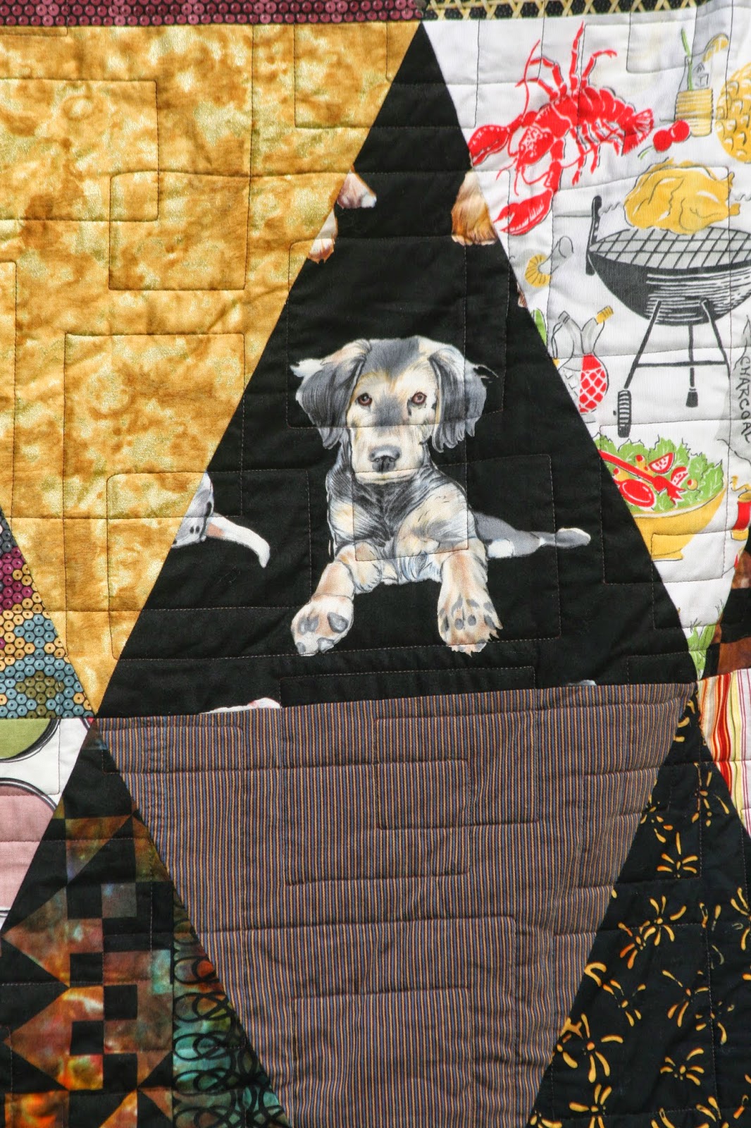
Tasha (and a woven strip shirt block) and a good example of the quilting.

I use the simple shape of the 12" x 13" triangle so I can concentrate on color and moving it around the surface of the quilt.


How the blues move and the brown and reds jump diagonally 

Sunday, March 16, 2014

Brite and Busy Quilt by Marinda Stewart

A number of weeks ago I published the post:Graphyx, Tangram and Disco Dot, in which I shared the four new colorations of Tangram (which was originally released in black-and-white)and Disco Dot.

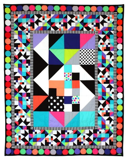
Michael Miller Fabric's premiere quilt designer Marinda Stewart was given the task of choosing one pair of the color combinations to create an original quilt. She took the story of Tangram full circle (mine is I designed a quilt top for my contribution to the Mirror Ball Dot challenge which I ran last year, and then revised it to be the print design Tangram), and Marinda did the same, only in reverse, by taking the fabric design and creating a central pieced panel for her Brite and Busy Quilt.

Once again Marinda has created an OMG incredible quilt. 

The instructions will be offered as a free download on the Michael Miller Fabric's website in the near future.

Sunday, February 23, 2014

Graphyx, Tangram and Disco Dot

GRAPHYX, my black-and-white collection, debuted last October at International Quilt Market in Houston, Tx. I designed it to be a study of positive and negative space. Each of the prints uses a different ration of black:white or white:black (is the glass half full or half empty?)

(Image courtesy of Hawthorne Threads)
From left to right: 
Tangram, North Star, Bevel, Corset, Fishbone and Camellia

I have not figured out the exact ratio of B to W in each design, but it is apparent simply to the naked eye. I know that Fishbone is 1/2 black and 1/2 white while Camellia is mostly white with a black flower outline, and Corset is more white to black. Bevel appears to have more black than white, and Tangram? What about Tangram? I'll show you more below.

Tangram                                              North Star

Bevel                                                    Corset

Fishbone                                              Camellia

 I decided to make a little study of the group. I pieced the six patterns together and then had the pieced cloth dyed. It is interesting how the print designs are contained within a given space yet the dye transcends those borders and roams freely across the fabric. My friend Meriah of Maui Tie Dye dyed the cloth and I was reminded of an important fact about fiber. I chose a color scheme based on a silk scarf - and silk dyes vibrantly and intensely. When the same formula for the silk was applied to the cotton, cotton's super absorbency and cotton being cotton, the colors came down and didn't give the same effect. Then the scan didn't do the fabric justice but I believe you understand what I am trying to convey.


Now back to Tangram. The same design used strictly in black and white was manipulated so some of the black was replaced by shades of grey, and portions of the white substituted with color. Then to juxtapose the lines and angles of the design, we paired each of the four color combinations with my good old friend Disco Dot.

The four colored versions of Tangram and Disco Dot are being released this month. 

From top to bottom for both designs: Brite, Clementine,Jewel and Neutral.


And for those of you who might believe they're having a sense of deja vu with Tangram, I had originally designed a quilt top and then revised the layout for the fabric pattern ;)